Big-company websites are not fancier. They are easier.
Owners keep buying polish. The sites that feel expensive usually did a few plain things well.
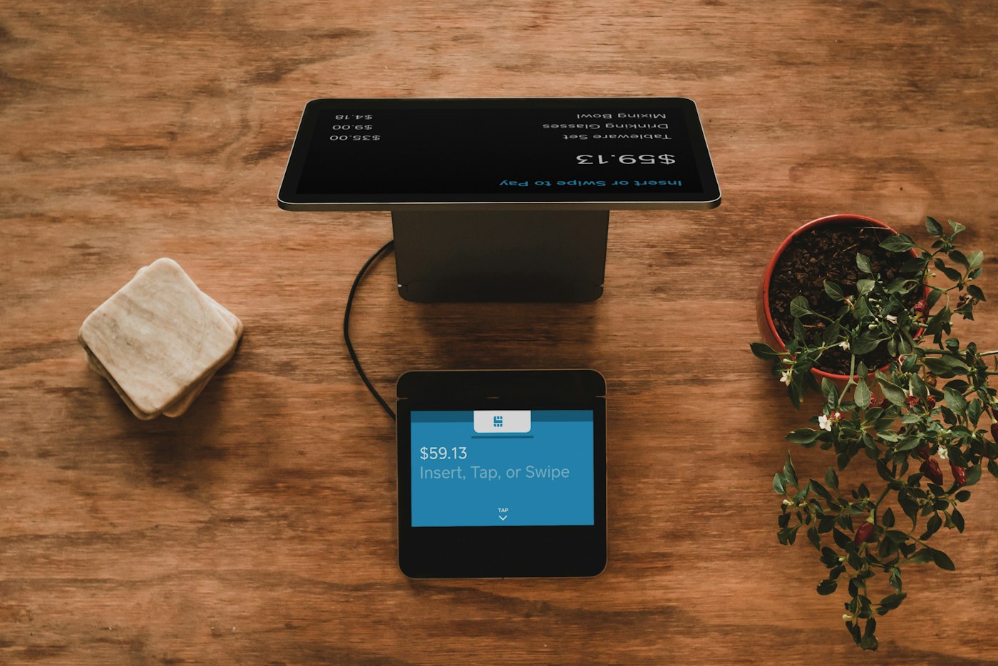
You can tell in about five seconds. Not because of a video background. You know what the company does. You know what to do next. The page does not make you hunt.
That is the whole trick. A "big business" website is not a bigger budget. It is a page that does not hesitate.
People do not grade your design. They grade their confusion.
A stranger lands trying to confirm you are real. They want to know you do the work they need, and that calling you will not waste their Tuesday.
If the headline is a slogan, they bounce. If the menu has eight items and none of them say what you sell, they bounce. They will not leave a note explaining why. They will call the company whose page already answered.
Stock photos and a slider do not cover for that. They make it louder.
Say the work in a sentence a neighbor would use.
Write what you do the way you would say it at a barbecue. Name the city and the trade.
"Family dentist in Clovis" beats "comprehensive smile solutions." "Roof repair in Fresno" beats "elevating the outdoor experience." You already know this in conversation. The homepage is where businesses forget it.
If a visitor cannot repeat your offer after one glance, the rest of the site is decoration.
One next step. Make it fat on a phone.
Call. Book. Request a time. Pick one. Put it where a thumb hits it.
A tiny "learn more" halfway down the page is how small sites stay small. A big, obvious button that still works on an old Android is what the grown-up sites have. Test it yourself. If the form dumps into nowhere, you look closed, even if you are standing at the counter.
Hours and a phone number belong on the first screen. So does the city. Not in a footer people never reach.
Use pictures of your place, not a catalog of strangers.
A real truck and a real person with a name beat a smiling stock couple every time. Big companies spend money to look specific. Small sites often spend money to look generic.
You do not need a photographer on retainer. You need current photos, shot in the light you actually work in, of the work you actually do. Crop them. Keep them consistent. Kill the one from the old location.
Same rule for words. First names. A face. "I'm Marco" is more company than "our dedicated team of professionals."
Leave room. Repeat yourself on purpose.
Big sites look calm because they do not cram. One idea per block. Same heading style every time. Two colors, not a rainbow. The logo does not fight the phone number.
Repeat the offer on the about page and the contact page. Repeat it on the service page too. Strangers do not read in order. They dip in. If each page assumes they already know you, they will assume you are hiding.
A 404 that still has a way to call you is a small thing. So is a favicon that is not the builder's default. Those details read as this place is open, even when nobody comments on them.
Keep the facts true, then stop decorating.
Wrong hours make a site feel amateur. So does a dead click-to-call, or a service you no longer offer. Not the lack of animation.
Update the page when the business changes. Then leave it alone. Extra motion and extra pop-ups are what owners buy when they are nervous the site is not "enough." Clarity was enough. The extras usually get in the way.
If you want a homepage a stranger can understand in five seconds, without turning the next month into a redesign, talk with Hexacomb. You run the business. We take care of your website.